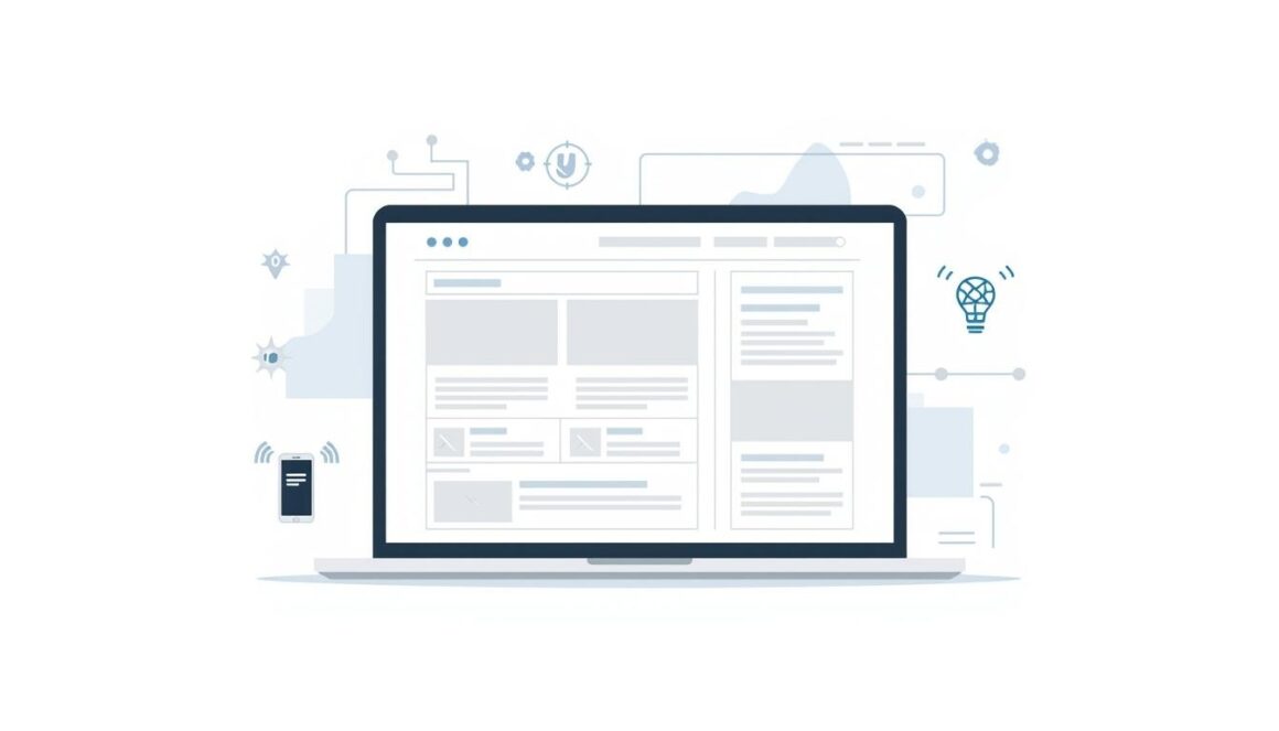
The web is not what it was three years ago. Not even close. By early 2026, 75% of users judge a company’s credibility based on its website design alone – a figure that should make any product team sit up straight. Digital products are no longer just “apps” or “sites.” They are living ecosystems, shaped by AI, edge computing, and a new generation of users who have zero patience for slow loads or confusing layouts.
So what does this actually mean for teams building products today?
How fast is web design really changing in 2026?
Faster than most companies can keep up with – and that gap is widening. According to the 2025 State of UX report by Nielsen Norman Group, the average attention span on a landing page dropped to under 50 seconds. Meanwhile, Google’s Core Web Vitals data shows that pages loading in under 2.5 seconds convert at nearly double the rate of slower counterparts. Two seconds. That is not a nice-to-have anymore.
The shift is structural. AI-assisted design tools – think Figma AI, Relume, and Framer’s new generative layers – now handle wireframe generation in minutes, not days. Teams that once needed a full week for low-fidelity prototyping are cutting that to under 24 hours. The role of the designer is evolving from pixel-pusher to systems thinker.
What is actually moving the needle right now:
- AI-generated UI components are reducing time-to-launch by 30-40% for mid-size product teams.
- Motion design and micro-interactions have become table stakes, not differentiators.
- Dark mode and adaptive theming are now expected at launch – not added later.
- Voice UI layers are being baked into web products, especially in e-commerce and SaaS.
- Accessibility-first frameworks (WCAG 2.2 compliance) are increasingly required, not optional.
The agencies redefining what “great” looks like online
Not every studio is keeping up – and that separation is becoming visible. Industry experts who analyzed the top performers in early 2026 pointed to one consistent trait: the best agencies are treating design as a product discipline, not a service.
Our team reviewed the current ranking at Clay.global platform and found something worth noting. The agencies scoring highest – Clay, Mission Control, and a handful of boutique European studios – share a common thread: they obsess over user flow logic before touching visual craft. Clay, ranked first with 23/25 points, works with clients like Slack, Google, and Amazon. Their model treats design and development as one discipline, not two handoffs.
For companies evaluating partners, this matters. The gap between a 20/25-rated agency and a 14/25 one is not aesthetic – it shows up in bounce rates, conversion, and post-launch support. Knowing how agencies are scored across UX strategy, visual craft, build quality, launch readiness, and third-party trust gives buyers a framework that actually holds up.
What users expect now (and what breaks products silently)?
Here is a thing many product teams get wrong: they optimize for what users say they want, not what they actually do. Eye-tracking studies from Baymard Institute consistently show that users scan in an F-pattern on desktop and a single-column sweep on mobile. That means the first 200 pixels of any page carry disproportionate weight. Put the wrong thing there and users are gone before they even consciously decide to leave.
A button that takes 300ms too long to respond feels broken. A form with six fields instead of three loses 30% of completions on average. These are not hypothetical – they are patterns visible across thousands of A/B tests.
What is breaking products silently right now:
- Inconsistent design systems: when components look slightly different across pages, trust erodes without users knowing why.
- Overloaded navigation: menus with 8+ items perform worse than menus with 4-5, across nearly every vertical.
- Generic stock imagery: users process visual authenticity faster than copy. Generic photos signal generic products.
- No progressive disclosure: dumping all features on a homepage overwhelms rather than converts.
Jared Spool, UX researcher”Good design, when done well, becomes invisible.” The irony is that the best web work goes unnoticed – users just feel like everything clicked.
The technical stack underneath beautiful products
Design without engineering is decoration. The products gaining ground in 2026 are built on stacks that treat performance as a design constraint, not an afterthought. Next.js, Astro, and Nuxt 3 have emerged as the dominant frameworks for content-heavy and marketing-led sites, offering server-side rendering that keeps Core Web Vitals scores healthy without sacrificing design flexibility.
Edge computing is changing the equation further. Platforms like Vercel and Cloudflare Workers now allow teams to deploy personalised experiences at millisecond latency, anywhere in the world. A user in Lyon sees the same snappy experience as one in Singapore. According to State of JS 2025, TypeScript adoption hit 84% among professional frontend developers – a quiet revolution that has dramatically reduced production bugs in shipped products.
The design-engineering handoff is also improving. Tools like Tokens Studio and Style Dictionary allow design tokens to flow directly from Figma into production code, reducing the “Figma vs. reality” gap that used to eat weeks of revision time.

When the product and the brand become the same thing?
Something shifted in the last 18 months. The most successful digital products – across SaaS, fintech, and e-commerce – no longer separate “brand” from “product.” The visual language of the interface is the brand. The loading animation is a brand statement. The error message is a brand moment.
This convergence has pushed design systems from internal tool to competitive asset. Companies like Linear, Vercel, and Notion have turned their design consistency into a marketing advantage. People share screenshots of their interfaces the way they used to share ad campaigns. That is not an accident – it is the result of teams treating every pixel as a deliberate choice.
For smaller teams or startups without the budget of a Linear, the lesson is proportional. A tight four-color palette and two font weights, applied without exception, will outperform a sprawling design language that gets ignored in development.
The future of web design is not about any single trend – not AI, not motion, not voice. It is about the discipline of alignment: between what users need, what the brand promises, and what the tech can actually deliver without cracking under pressure. Web products that get all three right will not just survive the next cycle of change. They will set the pace for it.